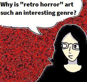
There are some genres of art which – like the Hotel California – you keep finding yourself returning to again and again. Whilst this always used to be cyberpunk art for me, I’ve noticed that – in recent years – it also includes a lot of “retro” art in general – but especially retro horror genre art. Imaginary screenshots of imaginary horror movies from the seventies or eighties, imaginary screenshots from imaginary nineties survival horror games etc…
To give you an example, here’s a preview of part a “late 1970s horror movie” semi-digital painting that I’ll probably be posting here properly in early February next year.

The full semi-digital painting should hopefully be posted here in early February 2025.
But what is so great about “retro horror” artwork?
For starters, drama and visual storytelling. If you’re making art in the horror genre, then you pretty much have to include dramatic visual storytelling. Whether this is expressions, composition or even just things happening in the painting, horror genre art requires visual storytelling. And, unlike many other genres, you can be a bit more melodramatic with it as well. As such, it instantly adds a lot more drama to your art.
Plus, whilst modern horror movies do this sometimes, older horror movies often had seriously amazing lighting design. The classic example is the bold red, green and blue lighting in Dario Argento’s terrifying 1977 film “Suspiria“.

This is a screenshot from Dario Argento’s “Suspiria” (1977), an ultra-suspenseful art-horror slasher/paranormal horror film which is not only still scary to this very day but which also has some amazingly creative lighting and set designs too.
Of course, horror movies from the 1980s often used cool psychedelic lighting design too. Not to mention that, like old Caravaggio paintings and “film noir” movies, visual media in the horror genre will often use gloomy and shadowy chiaroscuro lighting. Not only does this allow the director – or artist in this case – to use gloom to direct the audience’s attention to important parts of the picture, but the visual contrast between the gloom and the rest of the picture also makes all of the lighting and colours look bolder by comparison too. Yes, the cyberpunk genre also uses this technique sometimes, but it just looks inherently cool.
But why retro horror?
One of the interesting things about the horror genre is that it ages more quickly than many other genres. Because horror is at its scariest when it seems modern, realistic and contemporary, and because horror movies are often made on relatively low budgets, they tend to look a lot more like the general time that they were made in. See if you can guess the approximate time period that this horror movie screenshot comes from:

This is a screenshot from J.S.Cardone’s “The Slayer” (1982) – an authentic early 1980s “video nasty” (though it’s relatively tame by modern standards. It’s gruesome, but not as gruesome as you might think). It’s a atmospheric slasher movie, with some interesting psychological/paranormal horror elements, and it’s also an interesting precursor to Wes Craven’s “A Nightmare On Elm Street” (1984) too. Yes, the main character in this screenshot also looks slightly “late 1970s” – vaguely reminiscent of Ripley from Ridley Scott’s “Alien” (1979) – but given that the film was only made a couple of years after the 1970s, it makes sense that there would be some “carry over” here.
But, whilst a horror movie from the early 1980s might still carry traces of the late 1970s, a horror movie from the mid-late 1980s will look more obviously “1980s” than, for example, a sci-fi or action movie might. So, retro horror is an excuse to add stylised retro settings, hairstyles, fashions etc… to your art in a way which might not “work” as well in other genres.
These stylised “retro” elements automatically add extra atmosphere and intrigue to the art. Whilst you don’t have to be “100% historically accurate”, it’s worth watching at least a few older horror movies in order to get a general sense of what a particular time looked like, but also just the mood and atmosphere of those settings too. Horror is a genre that relies heavily on both of these things, after all.
Plus, once you get a general sense of the fashions of a particular era, you have a lot more creative freedom when it comes to adding costume designs. And retro fashions are also often more visually interesting than modern ones because they can look mildly unusual to modern audiences and make your artwork stand out a bit more.
So, yes, retro horror art is awesome because it pushes you to use dramatic visual storytelling and lighting. It also allows you to heavily emphasise the “retro” setting in a way that might seem too stylised in other genres, and it also allows you to include interesting historical fashions as well.
———————
Anyway, I hope that this was interesting 🙂